Let's ask NASA to bring back the "worm" logo

 Maxine K. signed
just now
  Adam B. signed
just now
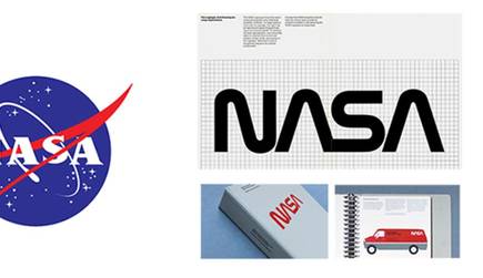
In the mid 1970s, the design team of Richard Danne and Bruce Blackburn were hired to redesign the NASA logo. Their striking design (at right in the image), often referred to as the "worm," was used for several years before being rescinded by Administrator Dan Goldin, and replaced with its predecessor (left), know as the "meatball." Replacing the bold simplicity of the "worm" with the more archaic and bureaucratic-looking "meatball" was a peculiar step backwards for an entity whose mission continually looks to the future...
It's hard to keep a classic down, however, and Danne and Blackburn's brand guidelines for NASA are now available as a hardback book for all you design aficionados, or anyone who has dreamed of space travel (just where are those jet packs anyway?)
NASA is riding a new wave of excitement with its discovery of water on Mars. What better time to consider reinstating Danne and Blackburn's logo.


Enter your details on the next page
Comment
See More 0